System Elements
Add Joomla functionality to your layouts.
System elements can be found in the element library under System. They add Joomla functionality to your layouts. If a page does not have the functionality, the element has no content output and collapses. Read more in the collapsing layouts documentation.
To learn more about general element settings, see the corresponding documentation.

Breadcrumbs Element
The Breadcrumbs element adds a breadcrumb navigation to a page. Take a look at the breadcrumbs element demo for a detailed showcase.
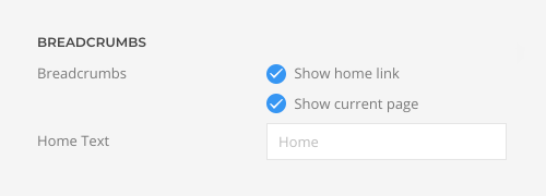
Select whether the Breadcrumbs element starts with the home link and whether the current page is shown at the end. Mind that hiding the home link and current page may cause the Breadcrumbs element to collapse if there is no other link to show. Additionally, enter the text for the home link.
| Option | Description |
|---|---|
| Show Home Link | Show or hide the home link as first item. |
| Show Current Page | Show or hide the current page as last item. |
| Home Text | Enter the text for the home link. |
Module Element
The Module element allows you to select an existing Joomla module and render it anywhere in the layout. If the module has no content output, the element collapses. Mind that since the Module element has its own settings, the general module settings are ignored. Take a look at the module element demo for a detailed showcase.
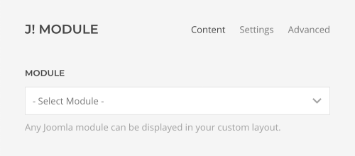
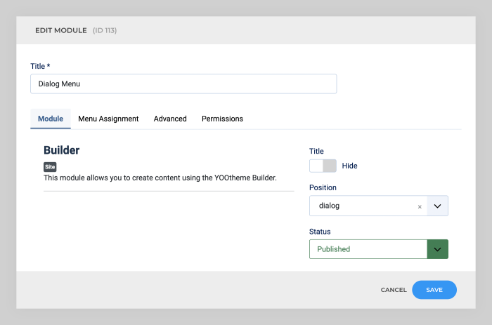
Click the Edit Module button to open a modal with the Edit Modules view from Joomla.

Here you can change the module's title, content and its options.
The Module element has various panel style options. It can look like a boxed card or a blank panel.

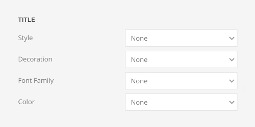
Define the style, decoration, font family and color of the module title.
| Option | Description |
|---|---|
| Title Style | Define the style of the title. Title styles differ in font-size but may also come with a predefined color, size and font. |
| Title Decoration | Decorate the title with a divider, bullet or a line that is vertically centered to the heading. |
| Title Font Family | Define an alternative font family for the title. |
| Title Color | Select the text color. If the Background option is selected, styles that don’t apply a background image will use the primary color instead. |
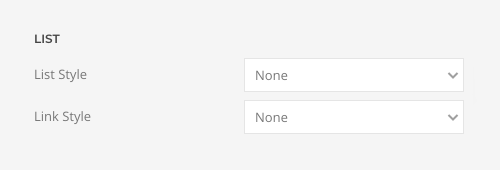
Set the list and link styles for modules that contain a list.
| Option | Description |
|---|---|
| List Style | Define whether the list items should be separated with dividers. |
| Link Style | Choose between the default link color or a muted color. |
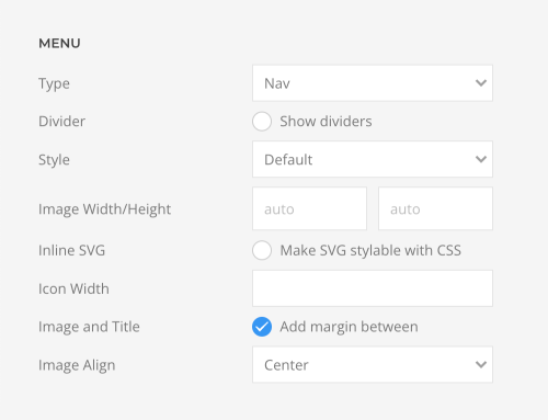
Define the style of the menu modules.
| Option | Description |
|---|---|
| Menu Type | Select whether the menu should be rendered as a horizontal subnav, a vertical nav, or iconnav. |
| Menu Dividers | Show optional dividers between nav or subnav items. |
| Menu Style and Size | Choose between the default, primary and secondary nav style and select the primary nav size. |
| Image Width and Height | Setting just one value preserves the original proportions. The image will be resized and cropped automatically, and where possible, high resolution images will be auto-generated. |
| Inline SVG | Inject SVG images into the page markup so that they can easily be styled with CSS. |
| Icon Width | Set the icon width. |
| Image and Title | Add an additional margin between the image and title. |
| Image Align | Align the image to the top or center of the menu item. |
Pagination Element
The Pagination element adds a pagination to a categorized article, category blog, featured articles as well as the search and tagged items page. The number of articles displayed per page is defined by the total number of Leading Articles, Intro Articles and Links which can be set in the Blog/Featured Layout option in Joomla. If all articles are displayed on one page, the Pagination element collapses. Mind that it is not intended to be used with custom sources.
Note By default, the Tagged Items page in Joomla uses the global Default List Limit option to define the number of items per page. That's why it is recommended to use the Compact List of Tagged Items page instead which has a # Items to List option under List Layouts. To do so, create a hidden menu item for the Compact List of Tagged Items and select all tags. The links of the selected tags will be automatically redirected to this page.
Take a look at the pagination element demo for a detailed showcase.
Choose between the previous/next or numeric pagination. The numeric pagination is not available for uncategorized articles. Optionally, show space between the previous/next links. Mind that on single article pages the pagination only navigates between articles from the same category.

Position Element
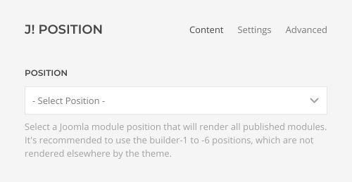
The Position element allows you to select an existing Joomla position and render all its modules anywhere in the layout. A typical use case is to render the sidebar position in any layout section. There are also six builder-1 to builder-6 positions available for the Position element which are not rendered anywhere else in the theme. The Position element collapses if all its modules have no content output. The appearance of each module is defined by the module settings added by YOOtheme Pro. Take a look at the position element demo for a detailed showcase.
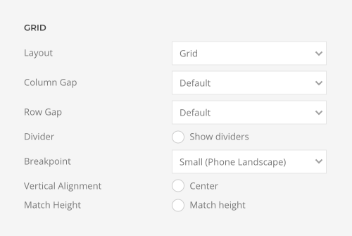
Choose the layout for the modules, set the column and row gaps and show optional dividers between them.
| Option | Description |
|---|---|
| Layout | Select whether the modules should be aligned side by side or stacked above each other. |
| Column Gap | Set the size of the gap between the modules columns. |
| Row Gap | Set the size of the gap between the module rows. |
| Dividers | Optionally, show a divider between modules. |
| Breakpoint | Select the breakpoint from which the modules will stack. |
| Vertical Alignment | vertically align modules if they have different heights. |
| Match Height | Match content height for all modules styled as a card. |
Search Element
The Search element displays a search input box. Take a look at the search element demo for a detailed showcase.
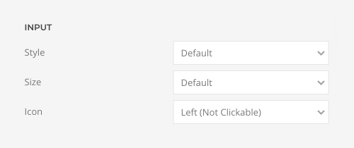
Choose between a default and a large input style for the search. If the default style is selected, choose between a Small, Default and Large size for the input box. Additionally, display a search icon on the left or right. The icon on the right can be clicked to submit the search.
